Tips of Typography in Web Designing

What is Typography?
Typography is the visual component of a well-scribbled word. And in this blog post, we are going to share some of the typography in web designing. To transmit the messages to the end-user. Sure, text in the form of web typography is the most obvious means of doing text. Headlines, text, fonts, sizes, line spacing, and paragraph spacing all affect the way information is obtained. The more text a website has, the larger the font it requires.
Why is typography important?
Here, if a client visits your website, they don't care much about the graphics of your website, it's a factual thing. What they do is, just go through the textual content. This all happens because the content is the major source of any information. So whilst designing or creating the content of your website every developer should take care of balancing the text and the graphics as well. This is where the typography comes into play. Typography is all about modifying the text within the design whilst creating great content on a website.
Moreover, it provides an attractive and eye-catchy appearance and preserves the aesthetic value of your content. Typography can change the entire look and feel of a presentation, that's why we are going to provide five reasons why typography is so important.
1.Typography impacts experiences: Here, the individuals understand completely your brand all through words or content in various situations. Whether they are seeing a message on your TV advertisement, viewing your website pages, or having a look at the name of your product, basically it's an experience for a customer.
2. It is the reader's friendly: All by implementing the fonts that are clean and easy to read are the key to any of the useful presentation. Just keep one thing in mind that if the font is quite small or cramped together, your presentation will be immediately ignored. In actual it is fun having a cool and complex project, but the audience should be able to comprehend easily what your presentation is saying.
3. It conveys a certain mood or feeling: In that case, the content might be an ADV. of a computer game. It might subsume some of the amusing features of that particular game and you should design the content that is fun, glamorous, and playful. If your content needs any seriousness you should select the fonts that are quite simple, plain, and more professional. Then the choice of such typeface determines how the content is being understood.
How to choose the best Font for a Website?
Typography is the visual component of a well-scribbled word. And in this blog post, we are going to share some of the typography in web designing. To transmit the messages to the end-user. Sure, text in the form of web typography is the most obvious means of doing text. Headlines, text, fonts, sizes, line spacing, and paragraph spacing all affect the way information is obtained. The more text a website has, the larger the font it requires.
Moreover searching for an impeccable web safe font, then your website's best bet is to browse the fonts on Google and search the Google font’s library and you'll find what you're after, in most cases. It is one of the superior places for searching web-safe fonts that provide over 800 free licensed fonts.
In essence, typography is an art and technique of arranging the type. It's central to the skills of a designer and is about much more than just making the words legible. In that sense, the choice of your typeface and how you work with its layout, colors, scheme, fonts, and so on will make the difference between a good, bad, and great design.
Let’s see which fonts and styles are best for your website!
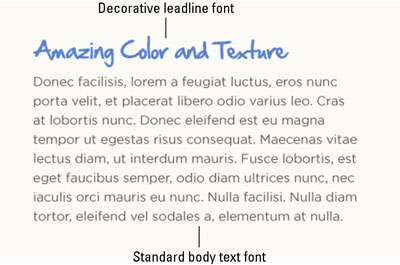
- Standard vs. Display fonts in Web Design: In web designing, the standard fonts subsumes Garamond, Times Georgia, Arial, Helvetica, and Verdana. Such fonts are designed for legibility and work well for larger blocks of the text. Usually, they are the common fonts that myriad of people have heard of. Moreover, there are numerous numbers of fonts, however, that fall into the "standard" category along with the names that you may not recognize. Generally, you should use standard fonts for pages of body text and reserve the fancier or decorative fonts, often called display fonts, for short headings, callouts, and subheadings.
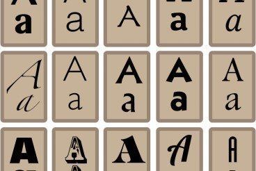
2. Serif Fonts: Serifs are the lines on the edges of letters and symbols. Their mission is to make characters more distinctive. The human brain spends less time recognizing a serif character. Serif typefaces are the most classical ones. They are associated with the main printed books and all the published literature in general. Their subtle flavor of classics reveals the stable and slightly conversion nature of the serif typeface group.

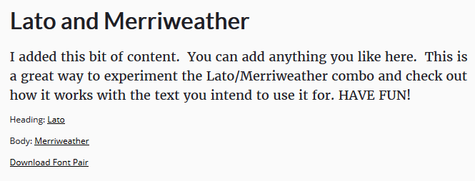
3. Merriweather & Lato: Merriweather light and Lato regular font style are a very clean and professional mixture. These are the popular choice because the options are so versatile. Plus it is modern, tasteful, and appealing and when it's followed with text scribbled in Lato, the pairing feels trustworthy. I'd recommend implementing this mixture on your homepage.
Especially for those of you who have a design that involves scrolling o attain more information, this text will work impeccably. I'm picturing a website visitor scrolling down your home page's screen, seeing an image on the left side of the page and this font mixture on the right. If this sounds like your current design, definitely think of using this mixture to add a touch of professionalism to your content.
4. Cinzel and Raleway regular: Cinzel is a bold font (no pun intended). The striking font naming Cinzel is a bold font. It contains all the big letters which usually makes it more worthy and suitable especially for the short text as opposed to long blog posts or things of that nature. It's complemented really by a font that's a bit more traditional, like Raleway. These two fonts are perfect for websites in the food and drink industry. You could consider using this to spice up your online menu. Have the menu categories in Cinzel black, the meal titles in Cinzel bold, and the description of the item written in Raleway regular.


Final Thoughts
The accurate way to choosing the best fonts for your website is to focus on the typeface choice principles and develop an aesthetic taste to combine the web font with the brand tone.
Good Luck, Keep Designing!

Comments
Post a Comment